Class Act - teaching material
Art direction and editorial design for Class Act Educational Services
Client: Class Act
Status: Completed
Industry: Education
Region: South Africa
Brief
Class Act is a Johannesburg based NGO operating throughout Southern Africa. They focus on poverty reduction and improved quality of life through education and community development projects. in 2015 Class Act decided they needed an update to their teaching materials. It was important that the design broke away from the dated visual language of the majority of textbooks in South Africa and that the books were easy to use for both the students and teachers.
Critical features: clean and modern aesthetic. language and glyph support for South Africa’s 11 official languages, Greyscale as the books would not be printed in colour.
Page Structure
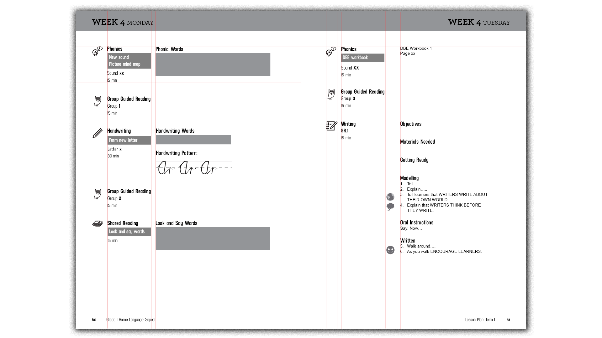
For clear designation and the ability to quickly reference the task and delineate where one is in the lesson the page is divided into 3 columns
index icons
task description
task content
For "writing days" an extra column is added for teaching prompt icons. These icons serve as teaching aids reminding teachers to "encourage Learners" and stop and "think before they write"
At the top of the page, there is the week and day written clearly. This allows both the teacher and learners to quickly find the tasks they need to be working on for that day.
There is a 5 baseline gap between the header and the first task and 3 baseline gap between all tasks. This ensures sufficient white space to allow each task to be easily be found on the page and to ensure the page does not become a giant wall of text and overwhelming for students
Typography
For the typography, I developed a system that was clean, bold and modern. This was in an effort to create a distinct shift away from traditional textbooks that still predominantly used serifed fonts and had walls of text in them.
An important feature of the textbooks is the task column. It quickly and clearly shows which exercises need to be covered in the lesson, the theme, how long students should spend on the activity and the requirements of the task
For this section, Neusa was selected. It is A tall condensed sans serif that carries great visual weight even at smaller sizes
For the Body font, Clio condensed was initially chosen for its contemporary feel, and the combination of density while still maintaining easy legibility and readability. This was important as these textbooks tend to become very information-dense at the time.
However, I ran into the problem that many of the South African official languages that these books would be translated into used characters that many fonts do not support.
To solve this I decided to use Arial for the body font as it has complete character support and pairs well with Neusa to maintain the modern feel of the textbooks.
Iconography Development
I also needed to develop a set of icons for the textbooks. These would be used throughout as a prompt so teachers and learners would quickly and easily be able to know what each task was and the methodologies involved.
I started initially with quite detailed icons, but these weren't quite visually refined yet and had the problem that at the small size that they would be used at the detail would be lost
I then refined it down to a set of line drawings. Class Act was not entirely happy with the motifs for group reading and phonics.
I took on their feedback and developed the third iteration of the iconography.
The final revision came in giving the person in the phonics icon recognisably African hair, as it was a requirement that all depictions of people should resonate with African learners.
Execution
This is an example of a completed spread. I kept the column structure even when there were no lesson descriptors as it was found during the initial test with a small group of teachers and students they liked the extra white space because they could use it to make notes for that section.


